Usability issues
 LoSboccacc
Member
LoSboccacc
Member
the ui is quite a mess
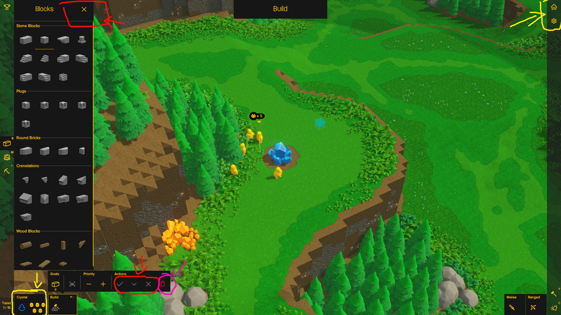
here you have in red all the thing that looks like they should exit from the build mode but actually dont
in yellow all the things you can click that actually players can click to exit from the build mode, but it's not clear whether they are interactive (bottom left "not a task" brickton tray that actually sits in the task list) and whether exiting build mode that way will either save or not task changes (menus on the top right)
in purple the only thing that looks like it's interactive, looks like it's gonna exit you from the build mode but only applies to a single specific case (removing the task)
why red thing don't close build mode?
why yellow thing looks like information element when they're actually interactables?
I like the stile and appreciate the effort of reinventing the user interaction to something original and in theme, but this is, like, real bad.
please consider adding placing interactive stuff with interactable icons where players expects them. a 'X' near build mode at the top would solve so much, in this case, as with having the accept changes/cancel changes exit build mode.
Comments